Family Planning
When you have children is there anything better than calm simplicity in your surrounds?
The owners of this house were quite certain what they didn't want: "We didn't want a Tuscan villa and we didn't want a hard-edged 1990s house. We didn't want it to be too trendy or too precious, and we didn't want it to date."
After collecting magazine photographs of houses and design features they liked, they found they could describe the house they wanted to move into. "We wanted it to be modern and solid and Australian - the Australian part was important - and it had to be practical with two children. We wanted to create a calm and homely atmosphere, and a design that would withstand the test of time."
They researched a few architects, liked the work of Bruce Willoughby, and discovered his attention to detail, focus on quality, and away from fashion matched theirs.
To look at the house now, it's almost impossible to believe it's a remodelling of a 1920s bungalow. However, "by retaining the existing structure, it was possible to have the side walls closer to the boundaries that would otherwise have been allowed by council," says Willoughby. Essentially, all that remains of the original house, apart from its footprint, is the main bedroom, now a study, on the street side. Another level was added and the "existing house was re-worked and extended", he continues.
The couple had certain budget restrictions, which "precluded creating any architectural marvels, " says Willoughby. "It didn't seem necessary to incorporate magnificent ceilings and roves: instead resources went into using high quality materials. The design is basically straightforward and sensible."

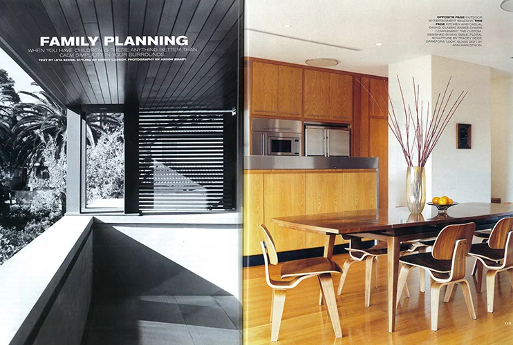
The generously proportioned house is on three levels: self-contained flat in the basement, opening to a loggia "which is good for summer entertaining out of the sun", says the owner; entrance level which contains study, formal and informal living areas and kitchen, with a wall of sliding doors opening to a north-facing terrace, large enough for a dining table for eight, with steps down to the low-maintenance back garden and new pool; and top level, with four bedrooms, bathrooms, walk-in linen cupboard, large front and rear balconies and, surprisingly, the laundry. "It makes sense," says the owner. "The only other place to have the laundry would have been in the basement, which would have meant carrying washing up and down stairs." A door leads straight out from the laundry to the terrace drying area, tucked away upstairs at the side of the house.
Entry down from the street to the main living level is via a broad set of Bundanoon sandstones steps, stepping stones over a long, narrow fish pond, and across a sandstone paved courtyard. "We wanted a private courtyard at the front of the house, something with presence," says the owner. A sandstone bench sits in one corner of the courtyard. "I had visions of having somewhere peaceful to sit and contemplate, but the children ride their bikes here, so it's not so peaceful at all. It's nice to look out on, though."
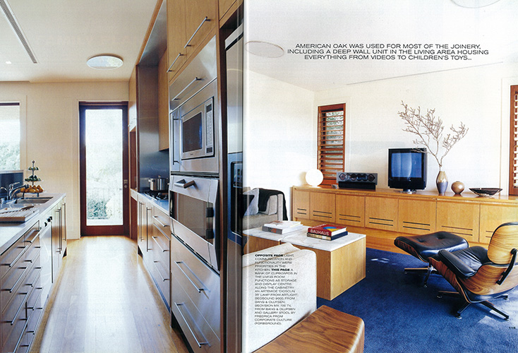
A simple palette of materials has been used consistently throughout the house: blackbutt for flooring, panna limestone and blackbean timber in all bathrooms, half strength White Birch on all internal walls, Louis Poulsen lighting, American oak for most joinery, made by David Reddy Furniture, and including a deep wall unit in the living area housing everything from videos to children's toys, and built-in desk in the study. ("The American oak was one of the hardest decisions," says the owner. "We didn't want to make a strong statement with the timber, which would have been the case if we'd chosen european beech, wedge or maple. They were being used a lot at the time.") The kitchen is of stainless steel ("I wanted something functional, easy to clean, something you could put hot things on, cut on, and oil could drip on," says the owner) softened with American oak. Outside, a clear finish has been used on timber under the eaves, gutters are of copper, exterior render is in a muddy tone which matches the sandstone paving. "These are all materials which improve with age rather than need refreshing," says Willoughby.
To liven up the otherwise neutral tones, colour has been introduced through abstract paintings, furniture, soft furnishings and rugs, chosen by interior decorator Lisa Stein Interiors. Almost all of the furniture has been bought for the house and includes classics such as Eames chairs and Barcelona chairs as well as custom-designed dining and coffee tables.
While there's a feeling of calm and simplicity about the place, there is also an element of luxury, particularly via the extravagant dressing area attached to the main bedroom. "It's like you'd find in a five star hotel," says the owner. Sloping shelves holds the shoes, ties and handbags have their special spots, sweaters are housed in deep drawers. As in the rest of the house, there is a place for everything and room to move.
Belle Magazine
Text by Leta Keens. Styling by Kirsty Cassidy. Photography by Anson Smart.